
Disney
Disney is one of the best online stores that a new entrepreneur can learn from. Every aspect of their online experience has been carefully thought-out and executed.
When you first visit the Disney Store website you can immediately see many marketing tactics in play. With one quick glance, you can see the urgency tactic being used, a free shipping offer and promotional deals. Using these tactics, whether on a homepage or product page, can help encourage sales on your own stores.

Next, Disney’s product categories have been designed with the customer in mind. Most shop via product category such home decor, fashion or jewelry. However, Disney recognized that many customers have a favorite character and allows customers to sort for products by character. While your store may not cater to specific characters, the valuable lesson here is to organize products with your customer in mind. You can take a look at your Shopify search data for hints on keywords your customers use to help determine categories.
Also, Disney’s images are often attention grabbing. Whether on a home page or product, there’s a notable emphasis on visuals and color. Let’s take a look at the Disney image below. This graphic has a mostly white background, however, the products pop with vibrancy as a young boy plays. The vibrant colors capture a scroller’s attention, making them stop to look at the products. The smiling boy also helps create an emotional reaction to help encourage parents to buy the toy for their son. It’s simple yet powerful details that can help guide your browsers to the right product.

Disney’s top navigation layout is highly optimized. According to Kissmetrics, the first and last item in the top navigation get the most views. It’s evident that ‘New’ was added as the first item because Disney understood that customers wanted to easily view new items. The last top navigation item is ‘Sale.’
Many ecommerce stores find that the ‘Sale’ section is often one of the most popular product listing pages.

Next, Disney’s reviews section continues to make the brand stand out. Instead of stars, they chose to use the silhouette of their mascot Mickey to stay consistent with their brand. Reviewers are able to create unique usernames and share some personal information which proves to be valuable to customers. You’ll know the age, gender, location and customer segment of the customer who reviews the product. This extra information helps confirm whether or not the product is right for you specifically.

Luxy Hair
Luxy Hair is another great example of an online store that’s worth learning from.
Luxy Hair’s About Us page should be used as a template for all store owners. They start their About Us page by welcoming people to their website. Then, they transition to telling their story. You can see pictures of the founders which helps customers get to know the creator of their favorite brand. It continues with a short paragraph about why people should choose their products. Next, you read succinct mission statement. Then, they flow into why they love their customers. If you continue reading, you can even learn more about their factory. You then have an opportunity to meet the team which showcases pictures of their staff. It concludes with job opportunities making it the perfect finish.

One of the best things about Luxy Hair is their content marketing strategy. Their YouTube channel has nearly 3 million subscribers with hair tutorials and fun videos related to hair. Their blog features unique content about hair products and hairstyles.
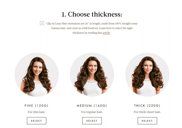
Notably, when a customer clicks on ‘Shop Hair’ they don’t automatically land on a page of product listings. Customers are guided through a personalized process to help them determine the best hair extensions for their hair based on their hair texture and color.
Next, customers are able to ask questions on the product page which get answered publicly by Luxy Hair. This is great for customers to see as most don’t want to look for the FAQs nor do they want to wait for a response from customer support. By seeing customer questions and answers on the product page they can make a more informed decision about the product.
Luxy Hair’s product page also provides the customer everything she needs to buy the extensions. First, there are product videos showcasing the hair being moved around. It also includes hair styling videos, product reviews, FAQs and more. Their website also offers before and after pictures of their extensions. This helps
Their website also offers before and after pictures of their extensions. This helps customer see how their hair will transform after purchasing the product as it shows volume, texture and length differences.

MVMT Watches
MVMT Watches another great online store to use as inspiration for your first store. The store’s branding is worth noticing. Many of the pictures show the watch as a focal point in a different fun or adventurous setting. It goes well with the watch theme as it offers a gentle reminder to make each second count without explicitly mentioning it.
Next, MVMT Watches masters bundling with sleek gift boxes. They offer gift boxes for him or her. The gift boxes include three items: a watch, an additional watch strap and a pair of sunglasses. They’re packaged in a beautiful black box. Currently, all of the women’s gift boxes are sold out. However, there’s a section where you can have MVMT email you when they’re available. The benefit of this is that it allows the brand to know a rough estimate of how much inventory they’ll need to order as they receive requests.

Another great thing about the brand’s website is that customers can ‘Add to Cart’ from the product listings page. As they scroll through the product inventory they can add items without having to go on the product page at all. This helps simplify the shopping experience for a customer who’s ready to buy.

However, that doesn’t mean that MVMT Watches product page isn’t made to convert because it definitely is. They offer upsells directly on their product page. Also, as a customer scrolls down, an ‘Add to Cart’ button remains on the screen to encourage the sale. In addition, they include badges such as free shipping and free returns to motivate the browser to become a buyer. Also, the product page includes Instagram pictures showing the specific watch being styled in different ways to help you envision it on you. Each product page also has a high number of reviews that can be read with ease by scrolling left or right to help build customer trust.
Amazon
According to Entrepreneur, Amazon originally started as a bookstore. Back in 1994, bookstores could only carry a few hundred books but Jeff Bezos recognized that by selling books online, he’d be able to sell them by the millions. Eventually, Amazon’s online store began carrying a range of other products. This story is a great example for online store owners.
It doesn’t matter what your first niche is because you can eventually expand into other categories.
Many new entrepreneurs start by trying to cater to everyone and fail to find their niche. However, by starting with one niche focus, you can eventually expand into other categories and grow into a mega brand.
Amazon’s product category layout is also worth noting. The online store uses specific product categories with a range of products. For example, under clothing, you can find the dress sub category and under that there are seven other subcategories. This allows customers to easily find the exact type of product they’re looking for.
Notably, Amazon also does a great job with product curation. For example, on Valentine’s Day, there are nine categories of curated Valentine’s Day gift ideas. Each curated category has beautiful gifts you can choose from for your significant other.

Amazon’s homepage showcases the most popular items. While they may not be catered specifically to you, it allows you to know what’s trending on their store. You may be able to find an item you wouldn’t normally buy but still love. However, Amazon is also big on personalization. You can also find a selection of recommendations that have been tailored for you.
Lastly, no matter which page you end up on, you can always access your browsing history. Most websites lack this feature. However, it comes in handy if you’ve visited a product page and forgot the name of the product you wanted to buy.
Tiffany & Co.
Tiffany & Co. is a great online store to use as inspiration for your first store. Their homepage uses a unique color combination of pink and seafoam green which helps differentiate themselves from other online jewelry retailers. Using images with a unique look can help separate your brand from others.

The product listing and product pages also have a clean, minimalist and seamless look.
When you click on a product photo in the listings, a product description pops up and you’re given the option to continue to the product page. Once on the product page, emphasis is on the product image with short and easy to read product details. The product picture shows the highest quality product first. Customers can reduce carat size for a more affordable piece of jewelry. Various product angles are also available to browse through. If a customer continues to scroll down, they’ll first be presented with an upsell. They can pair their engagement ring with a wedding band. It allows them to see which type of band best complements their engagement ring.

Notably, as engagement rings are high cost products, Tiffany & Co. offers financing options to their customers. If you plan on opening an online store with high cost items, you might also choose to offer financing options to your customers which would allow them to pay for the product cost in installments. However, you’d still need to pay your suppliers in advance.
Pottery Barn Kids
Pottery Barn Kids is unlike other kids websites. Most online stores for children’s products have vibrant colors. However, parents are the consumers of children’s products. This online store caters to parents, specifically mothers. The decor for children’s items are cute but also have a level of sophistication. Their ideal target audience is likely a parent with a higher net worth. Notably, the Pottern Barn Kids online store has a similar branding style as Pottery Barn to maintain brand consistency.
The product pictures allow customers to envision the product in their home. For example, a crib in different colors will be styled with different color bedding. Customers can also view customer photos of the same crib styled. This also helps customers decide how to decorate the room to ensure everything matches – and hopefully, buy more items from their store.

Customers are also able to select their delivery method within the product page. However, with this specific example, it doesn’t list the difference between the two methods to help customers make an informed decision.
Also, customers can even add their favorite items to gift registry for baby showers, birthdays or any other relevant event. If your online store sells items for babies or weddings, you may benefit from a gift registry Shopify app like Gift Reggie.

Gucci
Gucci has a unique online experience. Certain product pages include ‘Wear with’ sections with several different looks. When you click on ‘Get the Look’ you can see all of the products that complete the style and choose to buy those products. This helps customers create different looks with purchased items.

Another feature to use as inspiration for your online store is the callout on their product listings page.
Certain products have a bigger picture that adds more emphasis. If you have a best-selling item or a product that you want customers to check out, having a feature like this helps boost visibility.

In addition, Gucci has a ‘Gifts’ section that allows people to choose gifts for her, him or kids. The gifts in this section have high retail prices but are likely items that Gucci lovers would enjoy.
Notably, Gucci’s product selection has a consistent look that separates the brand from other online shops. When choosing products for your first store, consider choosing items with a similar style or appearance to help build a brand identity. The items don’t need to be identical. The goal is to choose products that have a similar style such as quirky, edgy or feminine.
Best Buy
Best Buy is a great example of an online store to use as inspiration for your first store. The electronics retailer has marketing messaging visible on their homepage. From ‘free shipping’ to ‘easy returns’ Best Buy helps ease the minds of customers to convert the sale. Their drop-down menu is also visually stimulating with a unique look for different sections.
Best Buy’s ‘Contact Us’ page allows customers to contact them in multiple ways. Customers can contact Best Buy via email, by telephone, in person or via mail. Having multiple means of communication gives customers the ability to resolve their issue in the way they’d feel most comfortable.

Best Buy’s sales items stand out within the product listings as their price is in a bright red font. It also lists how much a customer will save if they choose to purchase that item. Once a customer clicks onto a product page, they’re also shown special offers specific to that product. This allows customers to benefit even more from their purchase.

Casetify
For those of you planning on starting an online phone case store, Casetify is a great brand you can use as inspiration. Their product listings feature gifs that showcase movement, particularly with glitter cases. This helps bring the product to life as a product image isn’t enough. The product page’s imagery also pops with the gif image, different angles as well as a beautiful stylized shot.
Casetify organizes products in a great way. They allow customers to choose products based on phone or tablet model. They also have collections which allow customers to see products in similar styles such as marble, glitter, and more.

Lastly, Casetify also offers product discounts when you purchase at least two phone cases. This is an effective way to bundle products, especially if you showcase how much the customer will save when they make the purchase.

BaubleBar
BaubleBar is a great example of a jewelry store to use as inspiration. The navigation bar and its drop-down menu has a clean, minimalist look. It doesn’t interfere with the look of the website. Also, it doesn’t overwhelm the customer as it only has a few subcategories. While a BaubleBar customer browses the product listings, they can choose to see what the piece looks like when worn when they hover over the product image. If they like the way it looks on, they can then choose to visit the product page to purchase the item. On the product page, you can also view customer photos for the specific product. It allows you to view the product on different skin tones and with different outfits and accessories
While a BaubleBar customer browses the product listings, they can choose to see what the piece looks like when worn when they hover over the product image. If they like the way it looks on, they can then choose to visit the product page to purchase the item. On the product page, you can also view customer photos for the specific product. It allows you to view the product on different skin tones and with different outfits and accessories.

BaubleBar also has a loyalty program where customers can earn points for buying products. You can create your own loyalty program where customers earn points for purchases with the Loyalty Reward Points by Sweet Tooth app.

Next to the BaubleBar shopping bag, there’s a ‘Get 15% Off’ link. When a customer clicks on the link an email pop-up appears allowing a customer to get 15% off their purchase for signing up for the email. This is a subtle but effective way to encourage email sign-up.
