
What Is a Product Page?
Think back to the last item you bought online.
Why did you make the purchase? What convinced you to choose that website and product over the dozens of other options you likely had?
We’d wager that a lot of your decision was based on the product page alone.
That’s because it’s arguably the most influential page in getting your visitors to convert.
In a way, product pages are like salespeople in a retail store. They allow to you make a compelling argument for your product and answer any questions the customer might have.
It would be silly to have a retail store without good salespeople – so why risk building an ecommerce store without creating good product pages?
Plus, when you start running ads on Google or social media sites like Facebook and Instagram, you’ll direct traffic to straight to each product’s corresponding product page. This means you won’t be able to rely on brand-building from your other pages.
So what makes a “good” product page?
At the end of the day, it should check off a few boxes, like:
- Giving shoppers an accurate, vivid, and detailed look at the product
- Showing (not just telling) them how the product solves their problems and improves their life
- Instilling trust in various ways, from a clean design to robust information to social proof
- Delivering on its promises – in a straightforward and convenient way
There are infinite ways to fulfill these crucial requirements, but the keys lie in your overall product page format, as well as details like your product descriptions, images, and videos.
In this ebook, we’ll dissect these elements, give you best practices and tips for your own store, and show you loads of examples from brands that are doing it right.
Shall we?
Types of product pages
Before we get into the nitty-gritty of what a product page typically looks like, let’s go over two different types of product pages: the product landing page or ecommerce landing page and the product listing page.
Product detail page
The product landing page, also known as the product detail page, will be the key focus of this ebook. It’s a showcase for a specific item in your store. It shows all the details a visitor needs to know before deciding to buy.
At the very least, your product landing page should include a strong description, quality photos and/or a video, and a smooth pathway to purchase.
Allbirds has beautiful, sleek, and informative product landing pages.
For each shoe and its color variation, the website shows multiple close-up photos of different angles and a video of a model wearing them.
The above-the-fold descriptions are minimal, but Allbirds makes up for it with plenty of additional info underneath.
It shows the company’s Instagram feed, an explanation of their materials, a diagram showing the anatomy of each shoe, some key benefits, and customer reviews.
Product listing page
A product listing page (a.k.a, a collection page) is an aggregation of several products. It should show a thumbnail image of each product, its name, and its price.
It might include other details like a star rating, availability, or item variations.
Typically, a product listing page will show all of a store’s inventory, or listings by category.
Shopify store Bikini N’ Waves has a product listing page for each of its main navigation categories.
The site includes each product’s thumbnail, name, price (both original and sale price, if applicable), and colored small circles that visitors can hover their mouse over to look at photos of an item’s color variations.

Including a product listing page is a pretty standard practice, and one we absolutely recommend for your store.
It lets your site visitors browse through your offerings and get a general feel for your inventory.
Ain’t nobody got time to click through each product page individually when they’re not even planning to buy anything yet.
Anatomy of a product page
A strong product page checks off eight boxes:
- Important product details, like the name, price, and customization or variant options (like colors and sizes).
- A product description that highlights the product’s features and how it solves the visitor’s problems, needs, or desires.
- A high-quality “featured image,” or a large photo of the product.
- Additional images that the visitor can click through to get a better visual idea of the product’s size, texture, and use.
- A big, shiny call-to-action (CTA) button for the customer to add the product to their cart or pay now.
- An intuitive, easy-to-navigate layout, which typically shows the product photos on the left side of the screen and the product details and buy button on the right side.
- Social proof, like Shopify product reviews, product testimonials, or trust badges, to instill confidence in your brand and products.
- Product recommendations to cross-sell and boost the visitor’s total order price.
Time for an anatomy lesson to show these in action.
We’ll look at a Shopify product page for skincare company Bliss.
Product name
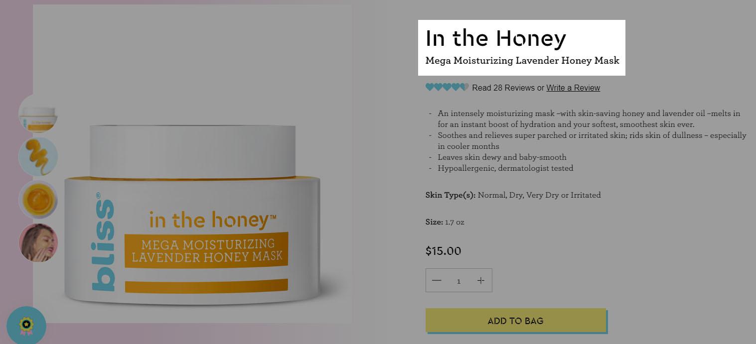
The product’s name, “In the Honey” is large and easy-to-read, and written in the company’s branded font. A short phrase underneath tells the visitor exactly what it is and what it’s for: “Mega Moisturizing Lavender Honey Mask.”
Social proof

Social proof in the form of product reviews gives visitors the opportunity to see how other customers have liked it. Product testimonials can convince potential customers to purchase your products. When users click this section, they’re taken to the bottom of the page to see all the Shopify product reviews.
You can do this easily on your own store with Shopify product review apps like Testimonials + Product Reviews, Comments, Ratings, + Reviews, or Loox Photo Reviews.
Product description

The product description uses bright and vivid language to paint a picture of what the product does for customers. It’s an “intensely moisturizing” mask that gives an “instant boost of hydration.” It “soothes and relieves super parched or irritated skin” and “leaves skin dewy and baby-smooth.”
Bliss also lists important details – it’s hypoallergenic and dermatologist tested, made for normal to very dry skin, and comes in a 1.7 ounce jar. There’s no question about who this product is made for (someone with dry skin) and how it can help solve that person’s problem (moisturize, hydrate, and soften it).
Price, quantity, and buy button

The price is easy to read. The quantity selector is directly underneath, so visitors can choose how many they want. Then straight to the “Add to bag” button – which is yellow to ensure that it sticks out from the other items on the page.
In addition to being noticeable, color psychology says that yellow is associated with emotions like happiness, positivity, and optimism. We’ll look closer at color psychology later in this chapter.
Featured image

The featured image on this product page shows the jar, and supporting product images allow the visitor to see what the texture looks like inside and outside of the jar, as well as what it looks like on someone’s face. This is important for a beauty product, as customers want to know what they can expect – especially when they’re going to smear it all over their skin.
Supporting images and video

When you scroll “below the fold,” you see more photos of the product in action, as well as a quick 10-second product video popup from the Bliss YouTube channel that shows the model applying the mask and goofing off.
It’s actually several photos edited together – just another testament that product videos don’t have to be high-budget productions to serve their purpose and boost your brand’s vibe.
Additional product details
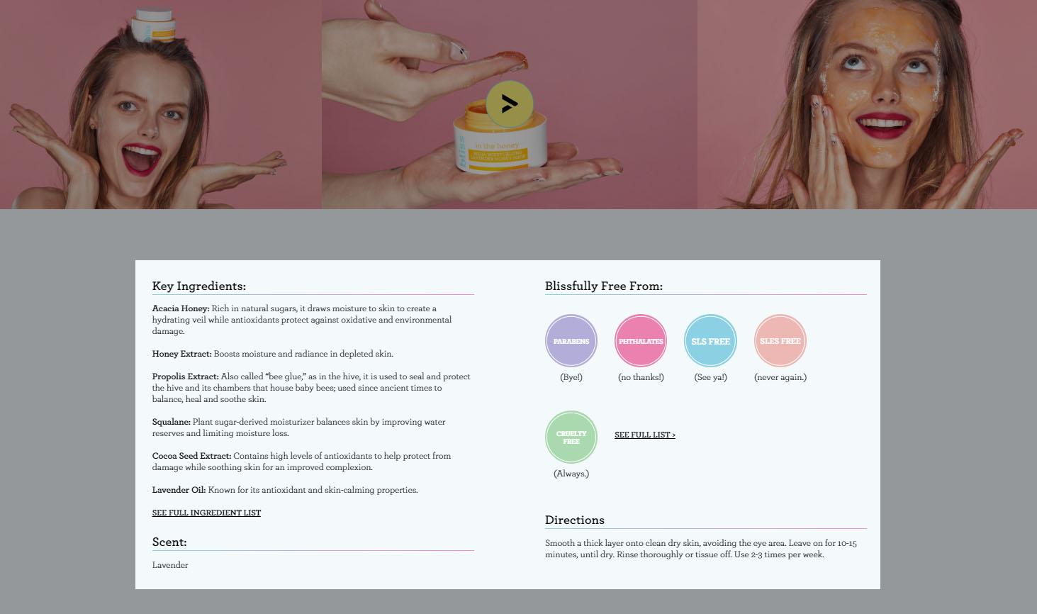
Under that, you see more product details: the ingredients, the allergens and irritants it’s free from, and directions for use. With the “Blissfully free from” section, Bliss makes a great move: in today’s world of skincare, there’s a large group of customers who are aware of buzzwords like “parabens” and “sulfates.”
They don’t like these by-products and they want to steer clear, making this section a welcoming beacon for the right visitors.
Product recommendations

The “Perfect Pairings” section is a glorious cross-selling opportunity. The name of the game here is increasing your average order value (AOV), or the average dollar-value for each customer’s order.
Tactfully recommending best-selling related products is one of the smoothest paths to a higher AOV. Take a look at Shopify product page cross-selling apps like Frequently Bought Together, Personalizer by LimeSpot, and Bold Upsell.
Customer reviews
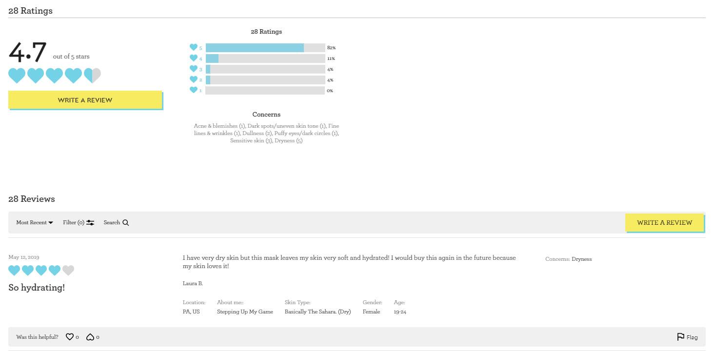
In the last section, you can read the customer reviews that were teased under the product’s name at the top of the page. Bliss even adds some customization by letting reviewers fill out some personal information like their location, skincare knowledge and habits, skin type, gender, and age range.
This gives visitors some more context into whether or not the product review is relatable and relevant to their own traits and lifestyle – which helps to solve one of the biggest issues with beauty product reviews.
Extra credit tips
In addition to what we’ve discussed, there are a few other product page tactics that can help you get more sales and higher customer loyalty.
1. Create a sense of urgency or scarcity
Nothing encourages an impulse buy like a limit on time or inventory. Urgency and scarcity tactics can help your Shopify product page perform better by motivating customers to buy instead of think.
You can do this in several ways, like showing which items are out of stock or size. This works well in the fashion niche. You can also host flash sales and other limited-time offers.
These Shopify product page apps can help:
2. Include an easy way to chat or message customer support
Customer service is critical. A great way to improve your credibility and perceived trustworthiness is to be transparent and communicative is to show a chat option on every page.
If we go back to Bliss, we see a popup chat option at the bottom right corner of every page.
It shows if any customer service reps are available to chat right now, and gives the opportunity to message the company directly, or via Facebook Messenger, Twitter, or Instagram.

3. Use color psychology to engage your target audience
Color psychology is the theory that varying colors can conjure up specific feelings or moods. We recommend using color psychology not only on your product pages, but also in your overall company branding.
Here are some key colors, and what color psychology says about the tone they can convey.
| Color | What it Conveys |
| Red | Excitement, energy, passion, danger |
| Pink | Femininity, playfulness, unconditional love |
| Orange | Creativity, enthusiasm, adventure, balance |
| Yellow | Happiness, positivity, optimism, warmth |
| Green | Health, growth, fertility, generosity |
| Blue | Peace, calm, stability, trust |
| Purple | Power, luxury, wisdom, nobility |
| White | Innocence, cleanliness, humility, goodness |
| Black | Power, elegance, sophistication, mystery |
It’s also important to consider the personal preferences of your audience. For example, one study on gender and color showed that men prefer shaded colors (colors with black added), while women prefer tinted colors (colors with white added).
The researchers found that color schemes with tints are soft, soothing, and youthful, while a scheme with shades is powerful, mysterious, and deep.
Of course, none of these assumptions will be right 100% of the time – there will always be exceptions and outliers based on your company and your audience.
 But color psychology guidelines can help harmonize your brand, products, and audience, so it’s worth some thought.
BONUS Color Psychology Quiz
You now know what a product page is, which elements make a page truly effective, and which Shopify product page apps could help you with your own store.
Next, let’s get more granular and examine how to write awesome product descriptions for your product pages.
Top Tips to Write Compelling Product Descriptions
When you’re building out your ecommerce store, you’ll have quite a hefty to-do list.
On top of things like building out your store, taking product photos, and creating and executing a marketing plan, it’s easy for something like product descriptions to fall to the bottom of your list.
It’s also pretty easy to just breeze through product descriptions without spending too much time or effort on making them truly impactful.
While this might be tempting, don’t give in.
The truth is that product descriptions are really important.
Research from eMarketer shows that 82% of respondents said that product descriptions and specifications influence their buying decisions.
Another study said that a whopping 98% of shoppers have decided not to buy an item online because of incomplete or inaccurate information in the product description.
See? Important.
In this chapter, we’ll discuss:
- Tips on how to write a product description
- Product description examples from other ecommerce stores that you can learn from
- A simple product description template that you can use for your own store
Let’s go.
How to write a product description
Here are five tips to follow during your product description writing process.
1. Understand your ideal customer
Who is your product for? Get to know things like:
- Demographics: What’s their age, gender, education level, income, etc.?
- Personality and beliefs: What are they interested in and passionate about? How does (or can) your brand resonate with these issues?
- Lifestyle: What’s their life like? What types of activities do they engage in? What types of products do they buy? What types of media do they consume?
Until you start making some sales, it might be difficult to know exactly what these answers are.
When you’re first starting out, do some market research to make educated guesses. Then tweak as you go.
Consider the ME05 Earphones from Shopify store Master & Dynamic.
In this product description example, the company writes that they’re “inspired by the design of the world’s fastest aspherical lens – the legendary Leica Noctilux-M 50 mm f/0.95 ASPH.”

To someone who isn’t into photography, this probably sounds like a bunch of gibberish. But to someone who is, they likely think these earphones are a masterpiece.
Master & Dynamic understands their audience’s interests and went straight for them as a part of their product description writing strategy.
2. Address the problem, need, or desire that the product solves
If your product has a unique selling point that none of your direct or indirect competitors have, you’re in a great starting position to get people’s attention and rack up sales.
But for most ecommerce entrepreneurs – especially dropshippers – you’ll likely have a fair amount of competition.
That’s why it’s critical that your product description speaks to a problem, need, or desire that your ideal customer has, and then swiftly shows how your product can help.
In this product description example, let’s break down some common considerations of men looking for upscale shoes, and how HELM’s Bradley Browns save the day:
- Getting their money’s worth: “Designed and made to last in both style and quality alike.”
- Looking good – with a side of ego boost: “A shoe that you’ll get stopped and asked about more than every once in a while.”
- Versatility: “Enough class to wear with a suit… enough versatility to wear with denim.”
- Simplicity: “Whether it’s a collared shirt or a t-shirt, Bradley is your go-to shoe.”

HELM knows what men are looking for when they’re shopping for nice shoes – and they don’t waste any time showing that this is the shoe for the job.
3. Keep it scannable
One of the fastest ways to lose a potential customer is to throw a block of confusing text at them.
A key tip for how to write a product description that keeps your visitor’s attention is breaking information into short, digestible chunks. Bullet points, headings, and graphic icons are a great help for making this happen.
In this product description example, Shopify store Primal Pit Paste divides its product description into sections with headings.
Under these headings, you’ll find short product description snippets with bullet points and images so you can easily skim through and size up the product without wasting your own time.

People are busy. Primal Pit Paste gets it.
4. Have a strong call-to-action
Calls-to-action (CTAs) guide your visitors along your intended sales funnel. They can take many forms, like asking them to make a purchase, sign up for your mailing list, share a post or product page, download content like a style guide or ebook, and more.
When it comes to a product page, your “Buy now” or “Add to cart” button is the predominant call-to-action.
But your product description can be a powerful way to add an extra push to your already actionable call-to-action.
Consider this product description example from Love Hair. It checks off the boxes of a strong product description, using descriptive words like “detox” and “revitalizing.”
As the last sentence, it includes a question – “Are you ready to reset your strands?”
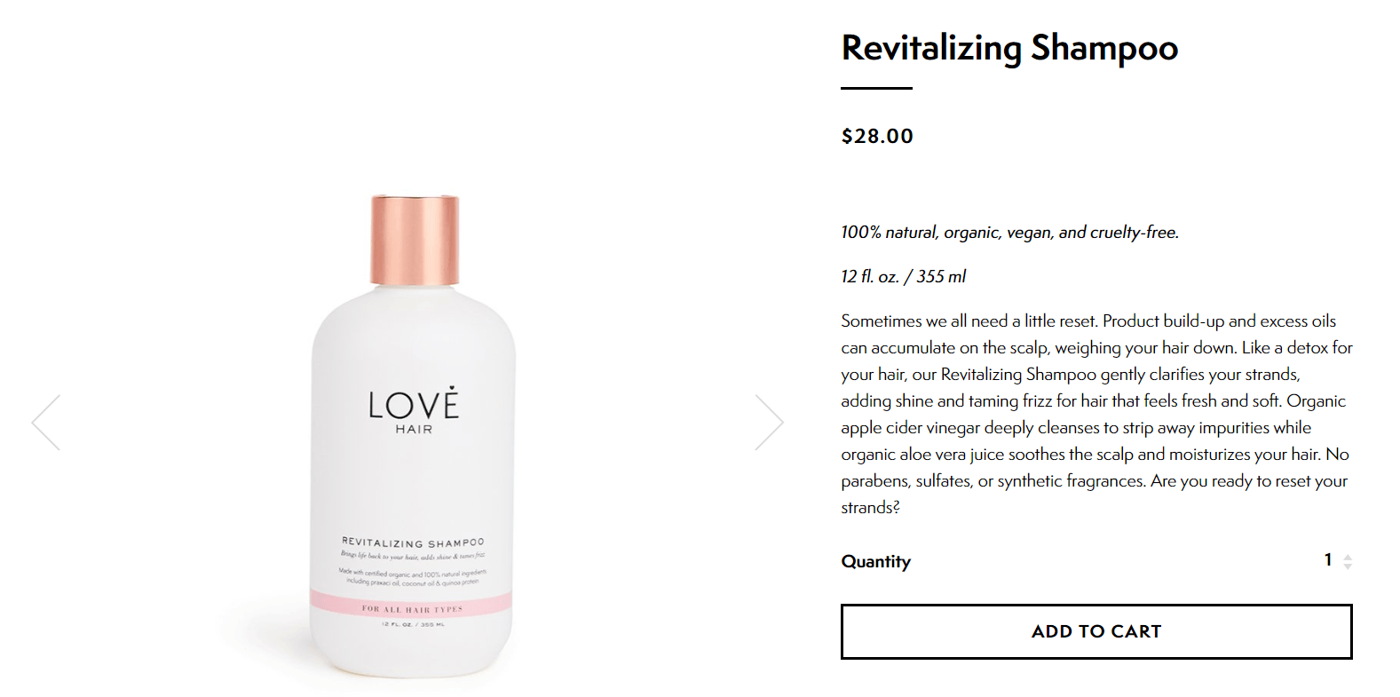
By directly addressing the reader, Love Hair’s call-to-action becomes even more actionable. It’s a simple yes or no question: will you reset, or will you stay weighed down?
This small detail can go a long way in helping visitors make a purchase decision.
5. Test and tweak until you hit gold
If you manage to make perfect, cash-cow descriptions on your first shot, we’ll personally send you a trophy.
But the reality is that everything about the ecommerce process is just that – a process. The name of the game is trial and error until you get to know your customers and find what fits best with their purchasing habits.
So what I’m trying to say is: don’t stress out too much if you’re not feeling immediately inspired.
Editing your imported product descriptions
If you’re using Oberlo to find products, the app gives you access to thousands of suppliers for almost every kind of product imaginable.
When you add a product to your Import List (in literally one click), Oberlo will conveniently import the supplier’s product descriptions so that they’re ready for you to edit.
Note: It also imports other key info like product images, which we’ll discuss in Chapter 3.
You can also directly import a supplier’s product descriptions if you’re using Oberlo to search for products on AliExpress. Just download the AliExpress Product Importer extension for your Chrome browser.

This extension makes it a breeze to import products directly from AliExpress into your Shopify store.
To learn more about this life-saving extension, visit the Oberlo Help Center or check out this tutorial video.
While importing product descriptions is a helpful foundation, your job’s not done.
These product descriptions contain key information that you’ll need to include. But as they stand, these product descriptions can be dull, convoluted, and confusing.
It’s critical that you revamp them and make them your own – writing product descriptions that are in line with your branding, personality, and business goals is crucial.
Take a look at the description for this “I Love You” projection necklace after it’s freshly imported into Oberlo.

There’s a lot of redundant and unnecessary information like “Style: Trendy” and “Item Type: Necklaces.”
And some pretty entertaining gems like “Gender: lovers.”
Here’s an example of how you can filter out the important details to craft your own product description:
Sometimes, saying “I love you” just isn’t enough. Say it 100 ways with this unique and stunning pendant necklace.
When you shine a light through the heart of the pendant, your lover will see a breathtaking projection that says “I love you” in 100 different languages. Pair it with our Infinity earrings for a Valentine’s Day she’ll never forget.

To help you implement these tips on your own store, let’s go over a quick-and-dirty product description template.
A three-step product description template for your store
As you write your own descriptions, follow this basic product description template. For each of the three steps, you can write just one sentence or a few.
Don’t be afraid to get creative, but don’t get carried away – if it’s too long or uninteresting, it’ll actually work against you.
Here’s the product description template:
- Show how the product complements your customer. What traits, problems, needs, or desires do your customer have that makes them a good fit for the product?
- Tie one or more product features to its benefit. In addition to explaining what the unique and awesome features are, tell your visitor the direct benefit they’ll get from it.
- Give them a simple recommendation or call-to-action. Suggest how they can use the product on its own or in addition to other products. Bonus if the other products are also in your store – a smooth cross-selling move.
And here’s the product description template in action:
Say you’re selling women’s push-up leggings and your brand has a fun, humorous tone. Your product description writing could go something like:
[1] You’ve been working hard to build those glorious glutes. The world deserves to see them. [2] These leggings use premium thick, breathable, and super soft fabric to hug your curves and accentuate all the right places. [3] With this kind of fabulous comfort and function, you can wear them all day… and we wouldn’t judge you for it.
And there you have it.
Now that you know how to write a product description that piques your audience’s interest and entices them to buy your product, let’s talk about how to do the same using your product photos.
How to Create Product Images that Convert
There’s no way around it: your product images matter.
As we saw in our Chapter 2 discussion of product descriptions, product images and descriptions are neck-and-neck for the two most important elements of your product showcase.

And another survey found that 60% of online shoppers in the U.S. said they need three to four photos on average before they buy a product.
This need for strong product images makes sense – it’s all they have to make the leap of faith that your product is as good as you say it is.
In this chapter, we’ll cover:
- How to find good photos online if you’re dropshipping
- How to take product photos at home if you have the resources
- Some product photo editing tips to perfect your masterpieces
- Additional tips, like photo sizing and alt tags
Here we go.
Be selective when choosing existing images
While we strongly recommend that taking product photos of your own, it’s not 100% necessary if you’re dropshipping. That’s because dropshipping suppliers often include decent product photos in their listings.
As we noted in Chapter 2’s discussion of product descriptions, both the Oberlo app and the AliExpress Product Importer Chrome extension will import key product info directly into your Import List.
Going back to our “I Love You” projection necklace example from Chapter 2, here are the photos that Oberlo automatically imported:

There are some duplicates, and a few that we just don’t like. No sweat, as you can just choose what you want and you’re ready for the next step.
You might also find a few that have logos or unnecessary text, which are usually easy to remove using a photo editing app, which we’ll discuss soon.
Pro tip: Before you choose a supplier, we recommend asking permission to use their product photos on your store. This can help avoid issues or complications down the road.
Finding stock photos
If you’re selling a common product, you may be able to find suitable product images on stock photography websites.
Warning: You must be certain that the image you’re using is an accurate depiction of your product. Otherwise, you’re committing false advertising, which can land you some serious penalties (not to mention it’s plain wrong). The slogan here is anti-Nike: Just don’t do it.
You can check out free stock photography sites like:
If you have some extra space in your budget, check out paid sites like iStock, Shutterstock, and Dreamstime.
For example, if you’re selling yoga mats, you can find some beautiful supporting photos that don’t necessarily feature your product, but can help create the tone and mood you want your brand to convey.
Like this one, which would be great for a yoga website geared toward adventurers and nature lovers:

But using other people’s photos can only get you so far. If you want true control over your brand, learning how to take product photos is the way to go.
Types of product images
Before you start shooting, you’ll need to figure out the type of product image that best showcases your store and its products. Here are some of the most popular.
Lifestyle
The lifestyle image helps people envision themselves using your product. Typically, these photos show people using the product in a natural way. For example, you can create lifestyle photos of people eating dinner on your tableware, or out and about while wearing your jewelry.
Example: Smartphone bike mount brand Quad Lock uses lifestyle imagery of their gear in use. In this photo of their smartphone bike mount kit, you can see raindrops on the phone case and trees in the background.
These seemingly small details play a big role in illustrating that the kit can withstand rugged and adventurous outdoor use.

Plain background
This type of product image is pure, simple, and very common: the realistic product shot on a white or plain colored background. Though not as evocative as the lifestyle image, it helps ensure visitors can see all the details, including the natural color of your product.
Plus, this minimalist approach can add a clean and sophisticated tone to your photos and overall brand.
Example: Luxury leather goods store Hard Graft uses plain background images to ensure potential customers can get a clear picture of its products.

Group
Group images are a great way to demonstrate options to the customer. These can be different variations of the same product, like multiple colors of a shoe. Or, they can be other types of items that complement the original one, like a case and screen protector for a smartphone.
Example: Minimalist product creator Studio Neat uses a group image on some of its product pages to showcase product variations to its visitors. Here’s an example of their Mark One retractable pen.

Pro tip: Photograph your products from all sides and angles to show a 360-degree view of your product. Experiment with different types of product images to see what works best for your store.
Now that you know the most common approaches, let’s look at the next step in the process: taking product images.
How to take product photos
If you’re on a budget or you want to learn how to take product photos at home, you can still get impressive results without spending thousands of dollars on special equipment.
Here are some helpful tips.
Get a decent camera
When it comes to buying a camera for product photography, a lot of less-expensive models can get you the quality of photo that you need without the high price. The Canon PowerShot SX530 HS and Nikon COOLPIX B500 are good options.
All you really need a camera that’s capable of taking high-resolution images that don’t look blurry on a digital screen.
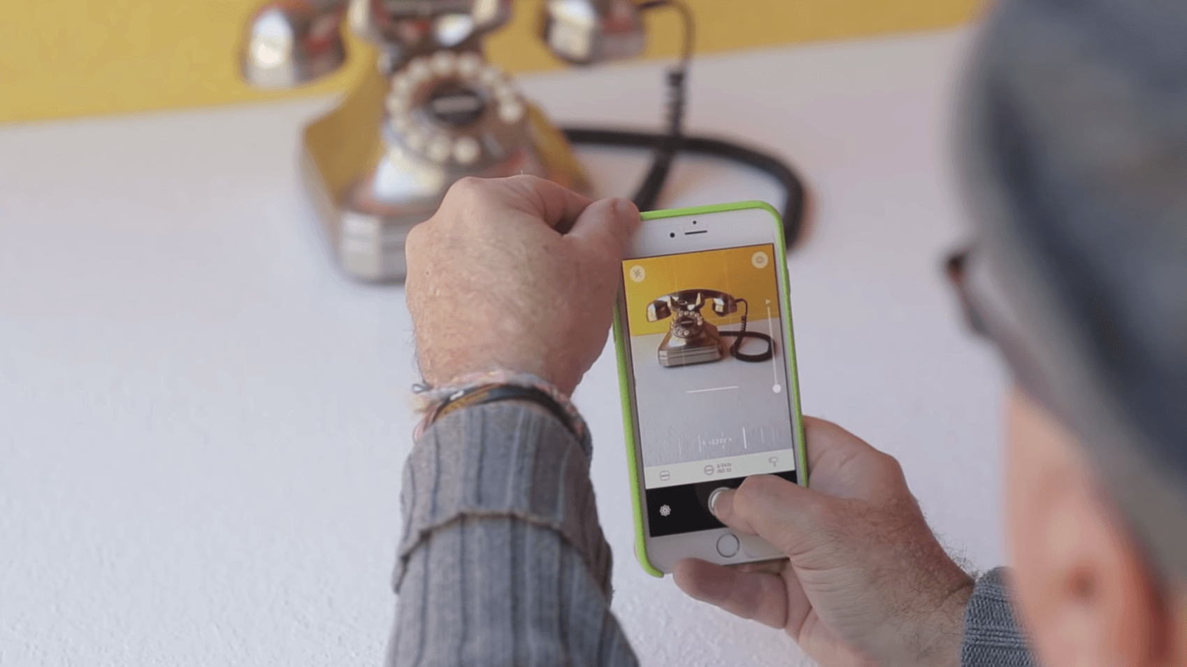
Newer smartphones like the iPhone X are also a great option. If you’re one of the many people who have purchased one, you already have a high-quality camera for product photography, right in your pocket.
To learn how to take product photos with iPhone models, check out this tutorial.
Invest in a tripod
For most people, getting clear shots means buying a small tripod. For smartphones and DSLRs, you’ll find a number of models in the $10-$50 range.
If you don’t have the budget for this purchase, try stabilizing your camera on a shelf or other sturdy base.
Create a simple lighting setup
The best lighting setup is one with lots of natural light. For the best results, plan to do your shoot in the golden hour (the time after sunrise or before sunset) to get clean, soft lighting.
The other option is to get a light box. These work well for shooting items like toys and jewelry pieces. You can even make your own DIY light box for less than $10.

Ideally, you should use natural lighting for capturing lifestyle images and a light box for white background ones. Some light boxes even allow you to change the white background by placing a colored paper chart inside the box.
Use image editing tools
Completing the shoot is just one aspect of creating great imagery. Editing your photos to enhance their appeal is important, too. You might just need a simple image resizer to edit your photos or you may need more.
Below is a list of product photo editing tools that you can use to spruce up those shots.
Pixlr is a robust online image editing tool that lets you add effects like borders and overlays in real-time. Its clone stamp feature copies a specific portion of an image and paints it wherever you like, which is handy for removing minor imperfections, such as a wrinkle on the background.
You can also crop and resize the image within the tool.

Originally intended for creating collages, BeFunky is now an all-in-one image enhancer that allows for hassle-free product photo editing. It’s especially useful when you have a model in your product image.
BeFunky even has specialized Touch Up tools, like the “Blemish Fix” feature.

You’re probably familiar with Photoshop, but Adobe also offers an image editing app called Photoshop Express. You can use it to adjust exposure, fix red eye, rotate, and more. When you’re done, add a filter or border and share your images via text, email, or social media directly from your phone.
Need more mobile-friendly options? Here are 17 photo editing apps for iPhone and Android.

Additional product image tips
Most ecommerce entrepreneurs understand the power of images, but even those with great product imagery can benefit from a few tips.
Without further ado, here are some unique ways to boost conversions with product photos.
1. Offer a way to zoom in
Fine detail is important, and the zoom feature on your product image allows shoppers to take a closer look.
For example, smartphone case maker Zero Gravity lets people zoom in to view the texture of its beautiful hand-embroidered designs.
Fortunately, zoom isn’t a difficult function to set up. Many Shopify themes have “image zoom” enabled. You can also use a plugin like Magic Toolbox to give people an up-close view of your items.

2. Reduce the file size of your product images
The file size of your product image can have a profound impact on the loading time of your site.
Smaller images (around 50 to 100 kilobytes) always load faster. But it’s critical to balance image quality so your site isn’t a blurry, pixelated mess.
To reduce the size while retaining integrity, save your image file as “.jpg” or “.png” and then run it through an image compression tool like TinyPNG.
You can upload several images on this platform, and it’ll return the smaller file size for each one. Upload the compressed files on your product pages to ensure they load fast. The faster your pages load, the more you can prevent visitors from losing interest.

3. Don’t forget to use the alt tag
The alt tag (also called alt text) describes the content or nature of a product image when it fails to load. To set up an alt tag, describe the product you see in words.
Alt tags also carry SEO value, as they’re indexed in Google, and may show up for image searches.
BONUS Ecommerce SEO Quiz
Most ecommerce platforms allow you to define the alt tag. In Shopify, you can write the tag as you’re uploading an image.
Another way is to edit an image and then write the alt tag in the relevant field.

Pro tip: It’s also important to ensure that your images look good on mobile. The best way to do this is to use a mobile-friendly ecommerce theme. Shopify has a range of mobile-friendly themes that automatically optimize your product images for the smaller screen.
4. Hire a photographer or editor if needed
If you don’t have the budget, skills, or bandwidth to learn how to take product photos at home, there are dozens of opportunities to hire professional photography talent for product photo editing and photography.
If you don’t have any existing connections, you can use freelance websites like:
A quick search for “product photography” on Fiverr returned 729 results.
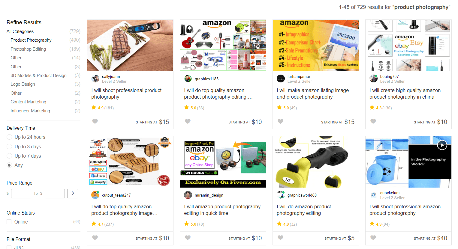
Some of these options are extremely affordable, but be sure to do your research and get examples first.
Now that you have the low-down on choosing, editing, and taking product photos that boost your brand’s appeal, let’s discuss how to create product videos in Chapter 4.
How to Create a Product Video That Boosts Sales
When people come to your website, they want more than just a description of the features and benefits of your product.
They want the full experience: what it’s like to use the product and how they can get the most out of their purchase.
One way to achieve this goal is to add a product video to your ecommerce store.
With a product video, you give visitors the opportunity to better experience how a product works and looks. And if your video features a real person putting it to the test, it not only builds confidence, but also helps to ease any doubts people may have about making the investment.
For example, the popular Shopify store Luxy Hair has a “See it in action” video that shows customers how to clip in a Luxy hair extension – swiftly answering one of the biggest questions that a potential customer has when buying this kind of item.
In short, you need to make videos an integral part of your product page optimization strategy, or risk losing out to the competition.
In this chapter, we’ll give you a primer on:
- How to create a product video
- Effective product video tips to implement right away
- The best product video creator for ecommerce websites
Let’s jump in.
How to create a product video
To create ecommerce product videos that inspire prospective customers to take action, follow the steps and product video tips below.
Prepare a script
Write out your script by outlining the main product features you plan to demonstrate in your video, then look for opportunities to bring your audience into the spotlight.
For instance, instead of replicating the antics of an on-screen presenter, speak directly to your potential customers. Compose the script in second-person voice – in other words, use words like “you,” “your,” and “yours.” This will keep the narrative on the right track as well as spur genuine engagement with your audience
End your script with a call-to-action.
Here’s a template you could use for the purpose.

Pro tip: When it comes to product videos, shorter lengths (one to two minutes) are more engaging than longer ones, and to produce short videos, you need a short script. Keep your script to two pages at most.
Choose a simple background
You want to ensure that your audience’s attention goes straight to your product when you’re explaining its features, so opt for a plain background without any distracting patterns. A good example is this light blue background from sleep product company Endy’s product video.
As you can see, the background is free of distractions and also contrasts well with the color of the product.
If you don’t have access to a simple background, consider buying a white muslin or black background stand kit for shooting product videos.
Shoot with your smartphone
As we discussed in Chapter 3, today’s smartphones can take impressively high-quality product images. Bonus points if you have an iPhone X or Galaxy Note 8, but they’re not necessary.
This goes for product videos, too, if you don’t have the budget for a mirrorless or DSLR camera.
As a general rule of thumb, always shoot your videos horizontally for widescreen footage – unless you’re shooting for Instagram.

While most social networks like YouTube, Facebook, Twitter and LinkedIn display their videos in horizontal mode, Instagram Stories displays them vertically.
To share videos on this platform, record separate vertical footage of your product.
Just like our product image tips in Chapter 3, we haven’t changed our minds about our recommendation to buy a small tripod for steady shots, and create a simple lighting setup like buying or making your own lightbox.
If you’re filming beauty or fashion videos, you should also consider a ring light to bring out the details and drastically improve the quality of your footage.
The result should be something like this ecommerce product video:

There’s ample light on the presenter’s face and the product.
Now that we’ve gone over the essentials of how to create a product video, it’s time to start shooting.
Product video tips to implement right away
Once you’re done with the shoot, the next step is to spruce up the video and decide how you’re going to use it to bring exposure to your product pages. Here are some helpful product video tips.
Add music and captions
It’s perfectly fine to insert some light background music in a one-to-two minute video.
For example, you can edit the video to play the track in the first 10 seconds where your logo and introductory message appears. Many websites out there offer royalty-free background music, including:
Apart from adding music, make sure to put captions (or text overlays) on your product video. IMPACT has a great article on why these are important, and how you can add powerful captions to YouTube and Facebook videos.
Google and Facebook will scan your video content for keywords, just like a blog article. Captions allow you optimize your message and make sure it’s found. Make sure you align this with your video title, description, and tags for maximum results.

Learn how to embed videos
Most ecommerce platforms allow you to embed videos within product pages. You’ll first need to upload the video to YouTube or Vimeo. Then, get its embed code by right-clicking on the video and selecting “Copy embed code” from the list of options.

Another option is to get a “responsive” embed code so that your video looks good across mobile, desktop, and tablet.
To do so, open your video on YouTube or Vimeo, right click on it, and then choose “Copy video URL.” Now open embedresponsively.com, paste the copied URL into it and press the blue “Embed” button. You should now see the converted code below the video’s preview.

Copy this code to use on your website.
Pro tip: Download the Easy Video app from the Shopify App Store. It’ll enable you to add videos in the Images section of your product page. After installing the app, you’ll be able to place the video’s link in the alt tag of your product image, and Easy Video will show the video instead of an enlarged picture.
Use recommended specs for social networks
In addition to embedding videos on your Shopify product pages, consider uploading the content to social networks. This is a guaranteed way to attract more eyeballs to your store.
However, every social media site has its own unique requirements for videos and images.
To help get you started, here’s a list of recommended video specs for every major social network. Keep this reference guide handy to get high-quality results for any channel.
 Facebook
Facebook offers a large variety of video formats and sizes to its users. Here are the specs for the most commonly used ones.
- Feed video – Recommended size: 1280 x 720, Aspect ratio: 16:9 or 1:1, Max length: 240 minutes
- Carousel video – Recommended size: 1080 x 1080, Aspect ratio: 1:1, Max length: 240 minutes
- Messenger video – Recommended size: 1280 x 720, Aspect ratio: 9:16 to 1.9:1, Max length: 240 minutes
- 360 video – Recommended size: 4096 x 2048, Aspect ratio: 2:1, Max length: 40 minutes
 Instagram
Instagram offers three types of video placements: Feed, Stories and Instagram TV (IGTV). Each require the following specs to produce high-quality results.
- Feed video – Recommended size: 600 x 600 for square, 600 x 315 for horizontal and 600 x 750 for vertical, Aspect ratio: 1:1, 1.9:1 or 4:5, Max length: 60 seconds
- Stories video – Recommended size: 1080 x 1920, Aspect ratio: 9:16 to 16:9 to 4:5 Max length: 15 seconds
- IGTV video – Recommended size: 1080 x 1920, Aspect ratio: 9:16 to 16:9 to 4:5, Max length: 10 minutes
 YouTube
On YouTube, you can either place videos in the Display (main feed) or in the skippable/non-skippable/mid-roll/bumper format. The specs for these are listed below.
- Feed or Display – Recommended size: 426 x 240 to 3840 x 2160, Aspect ratio: 16:9, Max length: 12 hours
- Skippable/non-skippable/mid-roll/bumper – Recommended size: 426 x 240 to 3840 x 2160, Aspect ratio: 16:9, Max length: 12 hours for skippable, 30 seconds for non-skippable, 30 seconds for mid-roll, and 6 seconds for bumper
Best product video creator for ecommerce stores
If you’re looking for a quick way to create a product video, you can use a video creator tool to get the job done. Product video creators are easy-to-use software with many of the bells and whistles of high-priced video editors.
While there’s no shortage of product video creators in existence, one of our favorites is Animoto.
Animoto makes it easy to produce videos to showcase your products or online store. All you need to do is upload your product images or clips and it’ll get your production rolling.
The creator also lets you customize your video with fonts, music, and colors. Once your project is finished, Animoto makes it easy to share content across social media platforms.
It’s all drag-and-drop and extremely easy to use.
If you don’t have experience with a professional video editor, Animoto could be your key to creating enticing product videos that elevate you above the competition.
By now, you should be feeling pretty confident about what it takes to make a stellar product page. As the final touch, let’s get some inspiration from a few examples.
6 Best Product Pages to Learn From
With each passing day, more and more people are buying stuff online.
They can’t help it. The convenience and simplicity are just too alluring.
It’s projected that global retail ecommerce sales will hit $4.8 trillion by 2021 – more than double its $2.3 trillion value in 2017.

This steady boom in online shopping means massive opportunities for aspiring ecommerce entrepreneurs. But it also means massive competition from everyone else who wants a slice for themselves.
Because your product page is the last thing a visitor will see before they decide to make a purchase – or lose interest and leave – it’s one of the most important pages of your whole store.
Fortunately, there are thousands of stores that serve as shining examples of how to do it right.
And we’re going to explore a few of the best product pages out there.
In this chapter, we’ll:
- Look at six Shopify stores with the best product pages
- Dig into specific elements and what makes them so enticing
- Suggest a few Shopify themes you can use to build your own
Let’s get to it.
6 exceptional product page designs
1. Rocky Mountain Soap

Rocky Mountain Soap has a clean, simple, and dare we say classic product page design.
It’s mostly white, but uses the brand’s signature earthy orange tone to highlight important elements, like the “Add to cart” and “Contact us” buttons, along with headings and clickable links.
Their brand is geared toward consumers who want pure and natural ingredients, which is why they focus heavily on this concept in their product descriptions. There’s a designated “Ingredients” tab, as well as a tab explaining how to use their products and a tab for shipping.
This Baby Bear Soap page uses sought-after terms like healing, fair trade, organic, and natural.

Below the fold, they recommend similar products to snatch some cross-sales, then go straight into their impressive product reviews.
When your products have 46 five-star reviews, it’s safe to say you’ve got a pretty awesome product and brand as a whole.
2. Argent

Argent has one of the best product page ideas for creating a sense of scarcity and urgency.
In the main navigation of their ecommerce website design, there’s an “Almost Gone” tab.
While most websites use more indirect language like “Limited availability,” this word choice seems to pack more of a punch in getting the point across.
When you click through certain sizes, you’ll see that the black “Add to bag” button turns into a gray “Sold out” button, which reinforces the scarcity of this product and naturally boosts the shopper’s sense of urgency.
The product description is impressively precise in describing how it will fit and how customers can use it, saying things like: It’s not fitted, but works great as an alternative to outerwear for warmer climates or a layer for cold offices.
It also includes a detailed size guide, helping to eliminate the biggest problem with online shopping.

At the bottom of the page, you’ll find recommendations for other Argent items that pair well. Smooth cross-sell.
With its high price point, Argent does a great job of enforcing their products’ value while showing that they’re committed to customer satisfaction.
3. Thing Industries
Thing Industries has a lot of personality, and it really shines through in the company’s ecommerce website design.
It sells quirky products like banana-shaped pillows, birdhouse bookshelves, and wall hooks that look like boobs.
The website is image-heavy, putting its primary focus on bright, minimalist product photos shot in portrait orientation (meaning they’re taller than they are wide) that take up most of the screen and are designed to look great on mobile. They show the product in action with various uses, like as a keychain or bag holder.
As you scroll down the page, the product photos are lined up all the way down so you can see them in all their glory.
The product descriptions are simple and non-persuasive, because let’s face it – these are the kinds of products that more or less speak for themselves.
4. Leesa

When looking at buying a big-ticket item, consumers generally need more information and confidence in the product as compared to when they’re making smaller purchases.
At around $1,000, the Leesa mattress is a ringer for this necessity.
Leesa has one of the best product pages when it comes to providing substance around the product and addressing every possible concern that shoppers might have.
Above the fold, the product page design uses the brand’s teal and orange colors for accents on important items like price and the Affirm payment plan option.
As you scroll, you see beautiful custom graphics showing the composition of the mattress and its features. There are several sections that continue illustrating the benefits with the use of graphics and product photography.

You can even sort through reviews based on the category. Talk about going the extra mile.

And at the bottom, the FAQ section seals the deal.

It’s clear that Leesa has one of the best product pages – one where the design is a testament to their superior products.
5. 69
We talk a lot about best practices and guidelines, but sometimes, the rules are meant to be broken.
69 is a perfect example of an ecommerce website design that glances at the rulebook, pauses for a minute, and then gives it the middle finger. The result? One of the most eye-catching and best product pages.
Visitors can see this immediately, especially with the animated homepage that shows the models moving slightly while staring at you uncomfortably.
Instead of the logo and navigation at the top, they’ve placed the logo to the left of the screen and the navigation to the right.
The product pages solidify the brand’s irreverent personality. They’re supremely clean, simple, and direct with a black-and-white theme and very little fluff.

As a bonus to the heavy branding benefits, this technique leaves little room for shoppers to get distracted.
Overall, this is a refreshing reminder that you can find success off the beaten path, and that some of the best product pages break all the rules.
6. PRESS London

PRESS London has a different business model than your average ecommerce store, and it shows in the company’s product page design.
Ideally, they want customers to come back for regular juice cleanses, so customer support – in addition to cost and quality emphasis – is important.
To emphasize the cost value, there’s a “Subscribe & save” section that shows a 10% discount on a subscription versus a one-time purchase.
To reinforce the support element, there’s an icon that shows a 1-2 day estimated delivery, as well as a customer service phone number and email.
The brand also has a strong social element, with icons for shoppers to share the products on social media. The product page design also includes a “Refer a friend” referral program button at the bottom left of the screen.
Below the scroll, you can see descriptions and ingredients for all products (which is absolutely critical for consumables – especially ones that promote health), as well as tabs to see delivery details, product reviews, and commonly asked questions.

Overall, PRESS has a sleek ecommerce website design that makes good use of the brand’s serene green color. As you remember from Chapter 1’s introduction to the product page, green is a key symbol of health and wellness.
We feel healthier just looking at it.
Now that you’ve seen a few of the very best product pages, let’s run through some Shopify themes that will help you create your own beautiful store with minimal hassle.
Shopify themes for high-converting ecommerce website design
Your theme can be a make-or-break factor in your store’s success. The right theme can take a good ecommerce website design and turn it into one of the best product pages out there.
In the olden days – when you had to walk 15 miles in the snow to get to school every morning – a good ecommerce website design meant spending thousands of dollars and needing a professional web developer for even the smallest changes.
But today, Shopify makes it incredibly simple to drag-and-drop your way to a store that can compete with big brand names.
On the official Shopify themes marketplace, there are dozens of to choose from, all optimized for both desktop and mobile. There are also loads of general marketplaces and independent developers where you can find thousands more.
You can browse the official marketplace by collections, like:
- Trending this week: to see what’s fresh
- Minimalist style: for a clean, simple vibe
- Fun and lively: for a brand with more personality
- Big, beautiful images: if you want to flaunt your product images
- Great for large inventories: if you’re selling a high volume of products
- Great for small inventories: if you’re only selling a handful products
You can also choose themes that are specially made for certain industries, like clothing & fashion, electronics, health & beauty, furniture, and more.
If you have specific design or marketing tactics you want to implement, check out the “All Themes’ page. You can sort through themes based on the layout style, homepage and product page features, navigation styles, and marketing and social media features.
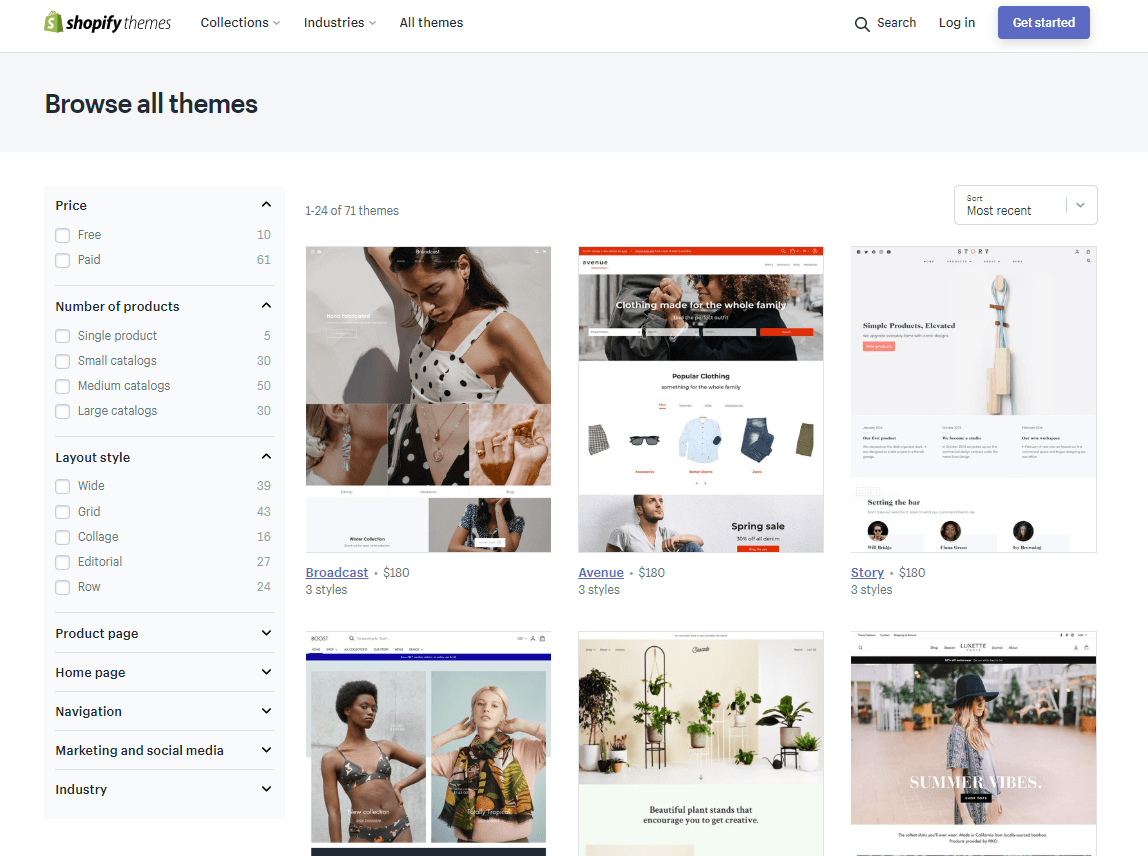
Here are a few high-converting free and paid themes from the official marketplace to check out for your new store.
Pro tip: Be sure to check out the demos and scroll to the bottom of each theme’s page, where you can see a few real Shopify stores that use it.
Free themes
A reliable theme that avoids clutter. It’s available in a Vintage, Fashion, and Modern style, and is ideal for new ecommerce entrepreneurs who are just learning the ropes.

Another simple theme that makes a good launching pad for beginners. It comes in Classic and Playful style.

Designed for large inventories, Supply comes in a Blue and Light style. Don’t let the name fool you – you can easily customize for your brand colors and other elements, just like the rest of Shopify’s themes.

Paid themes
Blockshop ($160)
Blockshop was made for beautiful product photography, boldly showcasing your hero image at the top of the homepage. It comes in four styles, all with minimal user interface (UI) to focus on your products. It’s a good choice for fashion stores, as it has size chart and product recommendation features built in.

Startup ($180)
Available in four styles, Startup is ideal for one-page stores or stores with small inventories. But its impressive level of flexibility and detail make it powerful enough for large-catalogue websites, too.

Parallax ($180)
This theme is aptly named, as it uses an ecommerce website design effect called parallax. As the user scrolls down the page, the background images move slower than the foreground section, creating a unique and eye-catching store. Parallax is available in four fun styles.

Conclusion
Well, folks, that’s a wrap.
In this ebook, we’ve covered:
- What a product page is, including different types and their basic anatomy
- How to write product descriptions that connect with your visitors and compel them to buy
- The ins and outs of taking beautiful product images that enforce your brand’s story
- How to use product videos to showcase your products and engage visitors
- A list of some of the best product pages on Shopify and how you can grow up to be just like them
We hope you’re feeling inspired, empowered, and ready to slay with your own dropshipping store – complete with product pages that delight and convert.
If you’re ready to take the leap, we’ve got just the thing – an online course that will bring you from ground zero to your first sale in just 21 days.